 ACBob's ZimZam - Blog
 Yep. I've done it again. I made another font. But this one's slightly different. And if you don't care for the article, grab it at GitLab
You may wish to open this image in a separate tab.
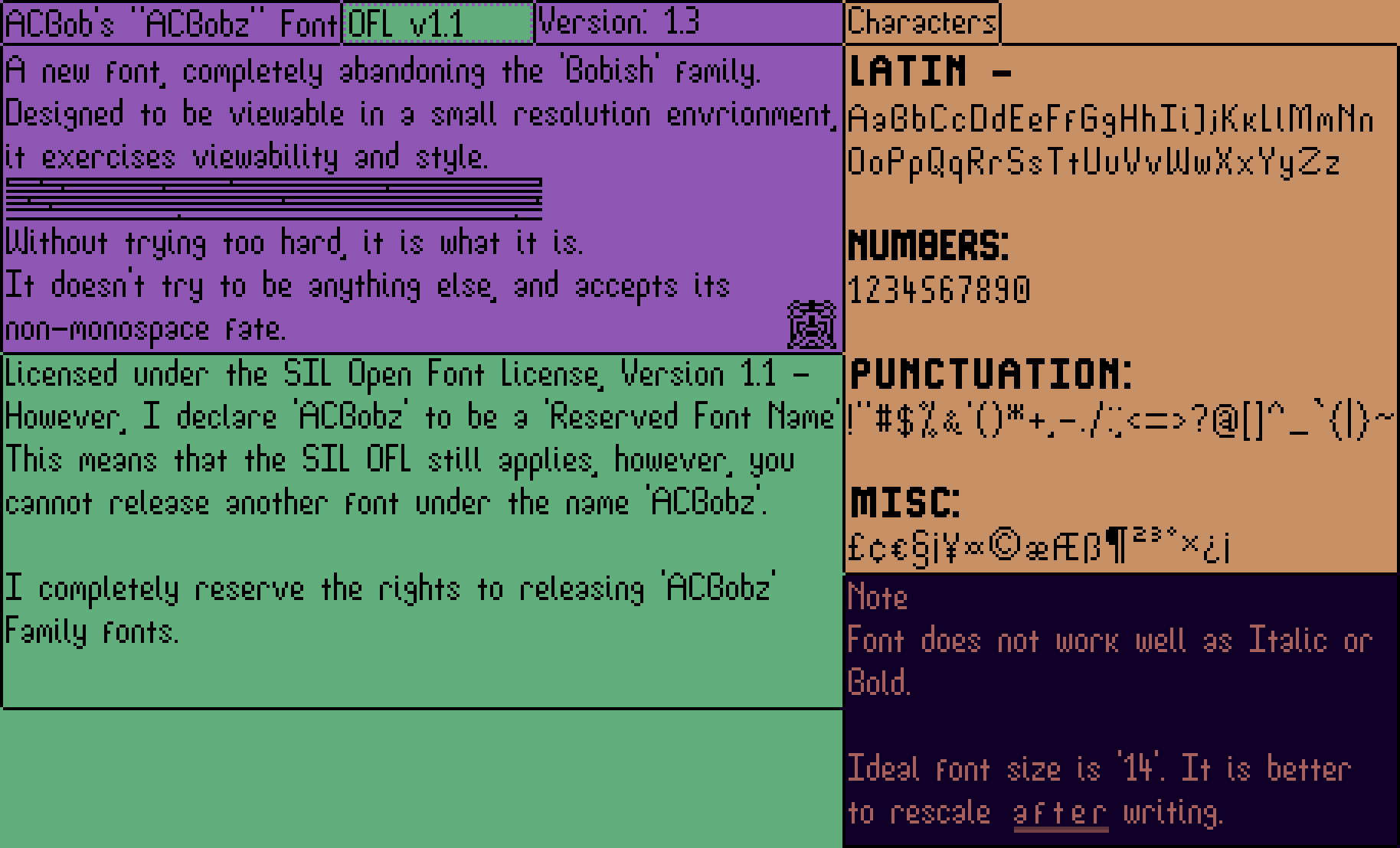
As you can hopefully read from the image, ACBobz (Also acceptable: ACBob'z) has been designed from the ground-up. No more different Bobish variants.
Bobish was great at the time, it was my first font, and it taught me quite a bit. I'd tried multiple times to improve it. Going steadily from v1 to v12! In that time, it became monospace, prompting the first variant - 'Bobish Fluxuspace'. It was also good enough, and attempted to be more readable, but Bobish had a few flaws.
For one, Bobish tried way too hard. It thought it was great, purely because I made it. For second, from a style-perspective, it was all over the place. Some characters had serifs, others were sans-serif, and others just didn't look good.
So that brings us to ACBobz. The new font. Perhaps, a new font family? The future is yet to say. - Trying to rid myself of the sins of Bobish, I'm not even going to force it upon poor visitors of my site. Additionally, I have properly licensed it. Bobish was confusing, And I now deem Bobish to be Public Domain. However, ACBobz is properly licensed under the SIL Open Font License. Containing a FONTLOG.txt and copy of the License as-well.
It has a more consistent style. Being sort-of rounded, while also having flattened areas. The punctuation needs work, but it works at the moment. With the consistent style, it also has a consistent font-weight, which is something Bobish really struggled with.
You can download the font HERE (ACBobz.ttf).
That's it for font-specific things. I'm now going to talk about the benefits for me, of making fonts.
This whole experience of making fonts (Both Bobish and ACBobz) has been fun over-all. I get to release my own interpretations of the English alphabet, along with improving my pixel-art skills.
An issue I have in the physical world, is my hand-writing. I believe i may have some form of dysgraphia, so constructing letters is rather difficult for me. However, after Bobish, i noticed a definite increase in the quality of my hand-writing. Bobish forced me to make a readable typeface, so i considered things like Spacing and Construction. Even when making the individual characters themselves, i would occasionally go 'Hang on, how would i do this with a pencil?', And that helped to contribute to changing my 'bpdq' letters, as well as 'gy' and 'a'.
Over-all, i think making these fonts has been a good thing for me.